There is perhaps no component in an entertainment system more personal than the handheld remote control. Sure, everyone in the family may use the same remote, but the remote is the device you interact with more than any other, typically on a daily basis. And a remote with a poorly designed button layout, or one that makes you play “hunt-and-tap” to find needed commands, can end up causing more pain and frustration than pleasure, which pretty much sucks. (I mean, unless you’re into that kind of thing. No judgment.)
While Control4 has regularly updated its Composer software and system hardware components, its line of remote controls has seen few updates since the company was founded in 2003. In fact, by my count, they’ve only had about five remotes in the past 16 years; the original System Remote Control (versions 1 and 2), the SR-150 and SR-250, and the still-current SR-260, released about 4.5 years ago.
Now, I’ll freely admit to being a diehard Control4 dealer and user, and I put my hands on an SR-260 remote either at my home or showroom literally every single day. And I’d say there is very little about this remote that I don’t like. For a daily driver, it gets just about everything right, with an intuitive button layout that lets me do roughly 90 percent of control without taking my eyes off the screen, an abundance of hard buttons for quick access to most tasks, and lengthy battery life when paired with the optional rechargeable battery.
But compared with some of the latest offerings from competitors like Crestron, Savant, ELAN, and URC, Control4’s SR-260 is more a hardworking member of the proletariat than a runway walking supermodel. I mean, if we’re being totally honest, even some of the Harmony models look cooler than the SR-260.
Whether Control4 recognized this shortcoming in its remote design, or they were just swept up in acquisition-fever, the company acquired Switzerland-based NEEO in February of this year. Founded in 2016, NEEO was making a name for itself in customer-centric control designs, and the press release announced that this acquisition would “enhance Control4’s plans for next-generation interaction devices across the smart home.”
And that next-generation device is now here in the form of the new Neeo remote.
Before I get too deep into the operation, I’m gonna gush about the way this remote looks and feels for a bit because that’s really the big story here.
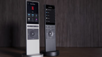
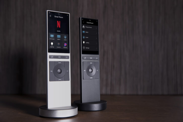
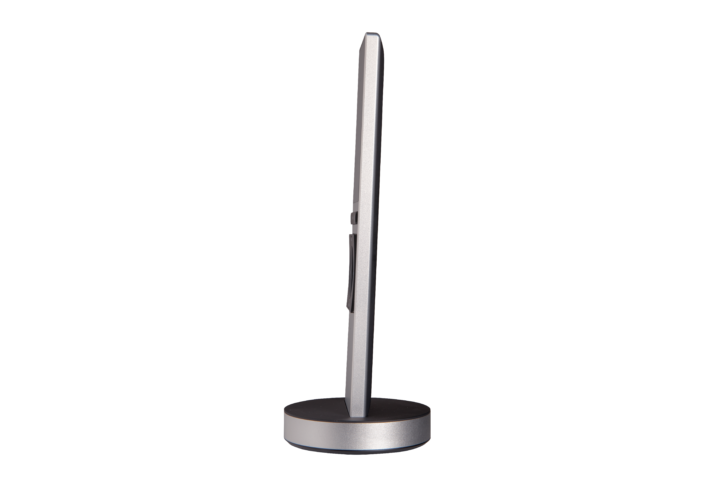
Visually, this remote is all sleek and style, oozing modern flair and panache. It’s wicked-thin, measuring just over a third-of-an-inch thick, with the top half of the remote dedicated to a 3.2-inch high-resolution touchscreen that features a micro-thin bezel and sports 480×800-resolution with a 291 ppi density, producing a vibrant, sharp image.
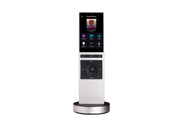
The remote’s lower half presents the most needed physical buttons for accessing frequent commands without looking at the screen. Manufactured from machined aluminum, the remote feels excellent in the hand; well-balanced and with a surprising amount of heft that speaks to quality fit and finish. The bottom third of the remote is devoid of buttons, further speaking to the remote’s precision and clutter-free design. At just over 7-inches long and 1.9-inches wide, the remote is not large and works well with people with small hands.
This is not some giant touchscreen or gaudy bauble that screams, “LOOK AT ME!” Rather, it’s a subtle elegance that says, “Yes, this is a high-end bit of kit, but what else would you expect?” in the same way of other stylish Swiss designs like an IWC Schaffhausen Portugieser Automatic around the wrist or a Mont Blanc Meisterstück in the breast pocket. The Neeo is the kind of product you’ll see sitting on a desk or table in some Hollywood film in an ultra-slick Manhattan penthouse, and think, “Yeah. That’s right. Good set design.”
Neeo stands vertically in its included docking station, which resembles a thin hockey puck. Some powerful magnets draw the remote into position and hold it firmly in place with a nice tactile “grab” that assures you it has been docked. The base is shockingly heavy, but this is by design so you can pick the remote out of the base without disturbing it. John Wick could likely kill someone with the dock without doing it any harm.
Integrating Neeo into a Control4 project requires it to be running the latest version of Smart Home OS 3. And if you’ve updated any of your projects to 3.1, then you likely noticed a new driver that automatically added itself: Remote Hub. This ingenious little bugger makes it so your customers can add a Neeo to their system with literally zero assistance on your part. That’s right, send your customer home with a new Neeo and they can easily add it to their system without you lifting a finger, remotely or otherwise.
When Neeo is powered on for the first time, it walks you through connecting to an available Wi-Fi network. (It works with 802.11 a/b/g/n 2.4 GHz.) Once connected, it seeks out and finds the controller running Director on the project, and then pulls in all of the rooms in the project, instructing you to pick the default room the remote will be associated with. It then pulls in the project and is ready for use.
Dealers can add a couple of tweaks in Composer, such as locking the remote to a single room (eliminating the change rooms option), removing the ability for on-screen control (akin to pressing the red C4 button present on all previous Control4 remotes), and disabling the “room off confirmation” screen. The biggest customization a dealer can add is creating up to five custom buttons that can be programmed to do anything the client’s Control4 system is capable of. I used these for group shade control in my primary room, and for quickly switching the remote to control another room.
Ergonomics is a huge consideration with any remote control, but especially with a touchscreen that eschews all but 14 hard buttons. The remote has the precision balance of a throwing knife, and the touchscreen is well positioned for easy thumb access. The screen is also responsive enough to not confuse a swipe with a press, or positioning screen buttons too close together for inaccurate results.
With physical buttons for volume and channel up/down along with a D-pad and OK, the remote offers modern system control with less reliance on the touchscreen. For some sources (like my Apple 4K TV) the OK button doubles as a play/pause, which is nice. A well-positioned Back button — directly above the Up — is akin to cancel, and is used for navigating back out of menus like on my DISH Hopper or Apple TV, and a Menu button does what you’d expect. A Home button takes you to the top level of the touchscreen for selecting a different activity or accessing the custom buttons, and Mute and Room Off round out the physical buttons.
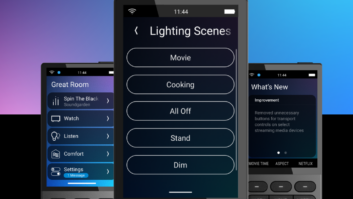
The screen gives access to additional functions like transport controls, 0-9 keys, and any device-specific commands, with these often separated into multiple “pages” under an activity with simple left/right swiping to access. The screen is also useful for lighting control, giving a sliding bar to adjust dimmers, or browsing lighting scenes.
The touchscreen also offers much more functionality than the SR-260 when streaming music, letting you browse your music collection or streaming services in a far richer manner. When music is playing, the screen displays high-resolution album art, with navigation controls minimized at the bottom of the screen.
Neeo is the first remote designed specifically around OS 3, and the Home page displays favorites arranged and ordered in the same manner as they appear on any Control4 touchscreen or phone/tablet GUI. With OS 3, users can easily “favorite” practically anything they want for quick, one-button access to things such as preferred streaming services, playlists, channels, activities, and so on.
Control4 recommends adding the Channels activity to let users browse and access channels by icons or genres. Personally, I find this takes more time than just using my Hopper’s on-screen Guide (or typing in the channel number manually), but for those that prefer browsing this way, Neeo offers an elegant looking approach. My one major nit with the Neeo’s implementation is that pressing the icon of the channel you want to watch doesn’t just tune to that channel, but rather brings up a “Select Channel” confirmation screen, literally doubling the button presses required. (I’d expect this to be something that can be defeated in future updates.)
Control4 touts that Neeo has a battery life of up to five days, but I’m guessing that would be just lifespan off-cradle without actually using the remote. In practice I got more like one-to-two days’ use between charging depending on how rigorously we were using it. Another real bummer is that the battery is not replaceable, which really sucks.
Also, one of the things some people expect out of 21st century devices is voice control. Crestron offers it, Savant offers it, heck even my DISH Hopper and Sony TV remotes both have it. The Neeo, however, does not. The Neeo might not be for everyone. In fact, power users and channel surfers might miss all of the dedicated buttons and features of the SR-260. And, seriously, if you and your clients are wholly content with the way the SR-260 looks and works, then the Neeo might not do much to blow their hair back. But if you’ve been wishing Control4 offered a remote that looked like it belonged and complemented a million-dollar home, Neeo is going to be your new go-to.
888-400-4070; www.control4.com
Kudos: Stylish and modern form factor; slick fit and finish; tack-sharp and responsive touchscreen
Concerns: Non-replaceable battery; battery life; no voice control
Product Specs
- First touchscreen remote designed specifically for Control4’s OS 3 (requires EA-series controller running version 3.1 or higher)
- 3.2-inch high-resolution capacitive touchscreen with 480×800 resolution at 291 ppi density
- Swiss design built from sturdy machined aluminum
- 802.11 a/b/g/n Wi-Fi connectivity
- 1270mAH Li-ion rechargeable battery with docking station
- Available in black or silver finish
- Dimensions: 7.15 x 1.91 x .37 (HxWxD); 12.52-ounces
