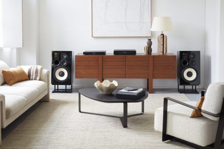
Harman Luxury Audio Group has introduced new branding for ARCAM that is created to lead its product development and industrial design into the future with three key tenets: amazing sound, British heritage, and luxury within reach. The branding was revealed with the launch of the ARCAM Radia Series, a new family of luxury audio products including the ARCAM A5/A15/A25 Integrated Amplifiers, the ARCAM CD5 CD Player, and the ARCAM ST5 High-Resolution Streamer.

As a storied British audio brand founded in Cambridge, U.K., in 1976, ARCAM will continue developing for high-end audio aficionados and music creators with a discerning sense of quality. However, the industrial design aesthetic was created to also appeal to a new and younger segment of customers with a more affordable, sleek, and attractive design without compromising on advances in audio innovation for future products.
“There is a third core customer where we see an opportunity, and that’s younger audio enthusiasts who are ready to elevate their sound systems by making investments in high-end systems but are more budget conscience, or as we say, luxury within reach,” says Tim Giblin, director of global marketing, Harman Portfolio Brands. “With an aspirational call to ‘Be the Centre of the Music,’ we are having our customers identify with a brand that is forward-thinking not only in styling, but in the sound innovation that has made ARCAM a top brand in luxury audio for nearly 50 years.”
The main design feature for the ARCAM rebranding is the introduction of Radia Yellow chosen for its contemporary look, its differentiation in the audio industry and its universal appeal. Radia Yellow is incorporated throughout the five new Radia Series products.
“Radia Yellow was chosen and so named for ARCAM because it speaks to everyone, everywhere,” says Jason Gokavi, principal designer at Huemen, Harman International’s in-house design firm, who worked with the Harman Luxury Audio product development team in the industrial design of the Radia products. “Music is energy and we wanted to hint at that energy by infusing the brand with a vibrant yellow that will be used throughout the product design and marketing assets going forward.”
The rebranding and product design doesn’t stop at the use of color. Made to be displayed out in the open and blend into a listening environment, there are also subtle design features made to be discovered and to enhance the performance of the product.
“While we wanted to retain a familiarity with how the product looks from afar, the magic is in discovering design details as you get closer to it, especially elements that are a nod to the rich British heritage of ARCAM,” says Gokavi.
For more information, visit www.arcam.co.uk.


