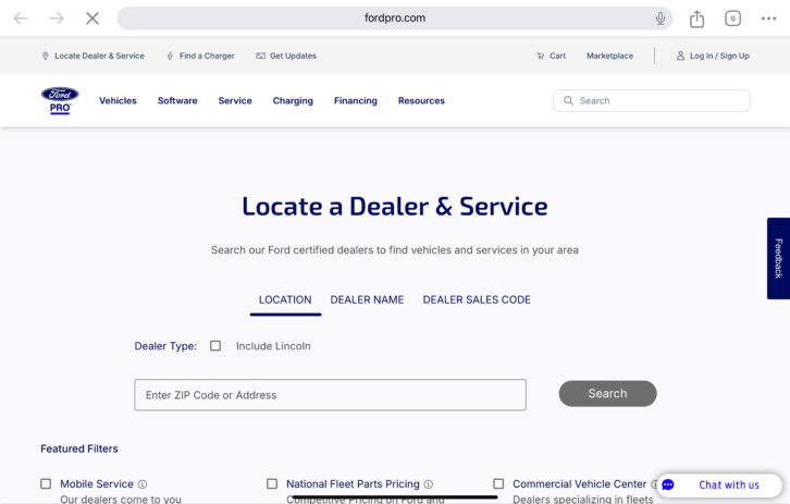
I received an email from Ford Motor Company earlier this week advertising the new F-150 Lightning pickup truck. I’d heard the buzz and had been thinking about my next vehicle since my buddies in Dearborn decided to scrap plans for my dream all-electric Ford Expedition. Clearly, I was in the buying mood, and I clicked the “Find a Dealer” prominently displayed in the middle of my screen.

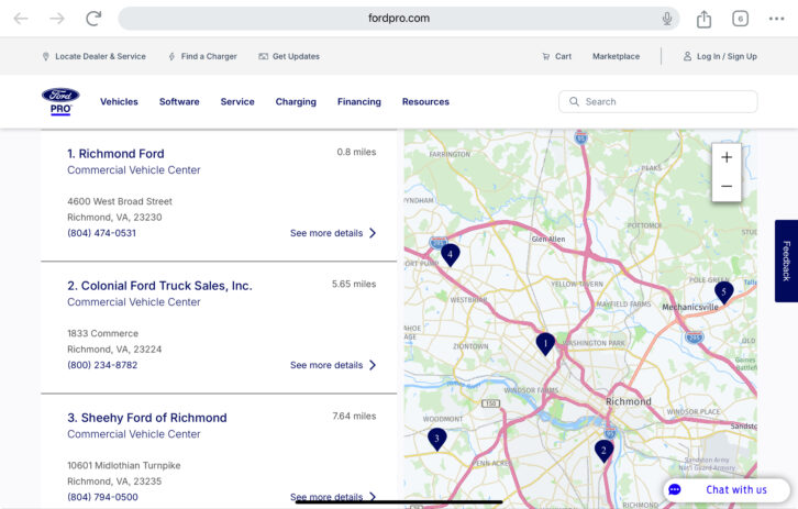
My web browser launched and transported me to a page where nothing about my truck could be found. I nosed around a bit and ended up going down a rabbit hole searching for my local Ford dealer. Still nothing about the Lightning. I decided to backtrack and found a “Vehicles” tab that allowed me to finally select the truck I’d been trying to configure for a few minutes.


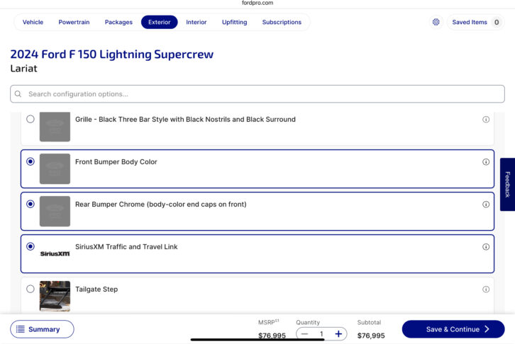
I drilled into the “Build & Price” option below the F-150 Lightning Pro and voila — there stood my future truck with numerous options to customize it. This seemed fun. I changed the paint color, added a longer-range battery…and then things got weird. I tried to upgrade the mirrors and was informed that I would have to delete some other items from the vehicle. I’m not an expert in such things and found myself wondering whether I would have spiffy mirrors to stare into sans wheels or maybe windows? Fear started to set in. Suddenly my choices seemed to be turning my new truck into a Frankentruck. Was this okay? Was this approved? Would my truck be sitting on blocks when I picked it up from the dealer?


All the options became too much for me and I abandoned ship, simultaneously deciding to write this blog. So many issues. So many. Let’s break it down.
- The email I received should’ve taken me right to a page where I could build and price the vehicle. After that, send me to a dealer. Not the other way around.
- There were five models of F-150 Pro trucks to choose from without discernible differences. This could’ve easily been remedied by placing them all in a grid with features checked or left blank stacked from entry-level to premium.
- Once inside the “Build & Price” configurator, I became a deer in the headlights pretty quickly. There were easily 50-plus options to choose from. While I appreciate some people may like that, there didn’t seem to be an easy good/better/best trim selection the way I’ve seen outfits like Tesla or Apple offer up.
Simple is hard. It’s the hardest thing to deliver to a customer. As integrators, we stumble in this key area all the time, finding ourselves worried about our competitor across town while nailing our own feet to the floor at the same time. What do your emails look like to customers? Are the calls to action relevant and take them to the right landing page? Do you offer too many choices?
Also by Henry Clifford: Learning From a Communication Breakdown
One of my mentors in journalism school challenged us to cut our articles in half. When we were done, he’d tell us to cut the remainder in half. What will you do in your business to reduce choice and increase simplicity?
Stay frosty, and see you in the field.


